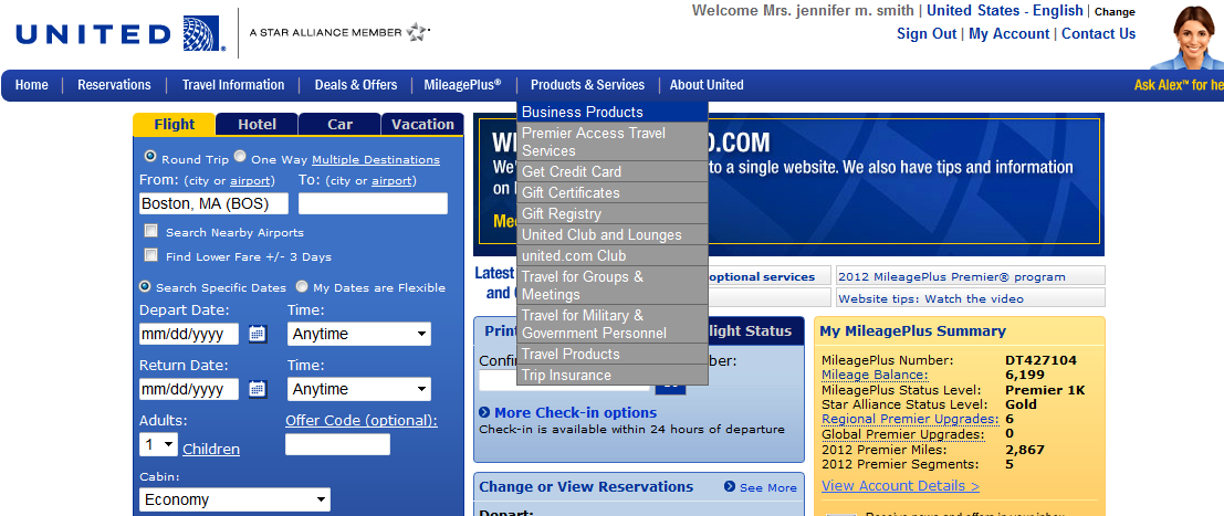
Let me first state that I like flying United airlines. It is my preferred airline, and I have logged hundreds of thousands of miles with them. What I don’t like is their new website. It will now be one of my prime examples of a poor user experience.
Not only does United’s new website have multiple components screaming for your attention, but it is also unfriendly to those of us who need to use it for the one thing that United really wants us to do…book a flight. I put a little thought (5 minutes) into what improvements would make the United site better, and I think it would be interesting for others to offer their opinion as well.
Improvement #1: Focus! Focus! Focus!
Cut down the content to what is needed. Maybe United needs a lesson in creating an application statement, for example “The United website makes it easy for travelers to book flights and give us lots of money…” An application statement helps define the purpose of the site, which I am not sure they know right now. Several good user scenarios wouldn’t hurt either.
Improvement #2:Make it Less Ugly:
I once learned from a great art instructor that borders are a sign of weak design skills. I don’t believe that is always the case, but combine all those colored boxes and borders with Improvement #1 and you have a pretty weak and messy result. It also shows just how unorganized their content is too.
Improvement #3: REMEMBER ME!
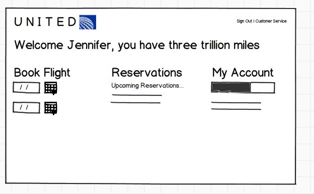
Don’t display that awful main screen to me ever again. A frequent customer will want to:
- Book a flight: Get from here to there
- Check account: Upgrades, points, etc
- See Reservations: to Check-in, print a boarding pass, or verify travel information
That’s it! Why create confusion with “Print Boarding Pass” or Change or View Registration on the main page, I should be able to get that from my reservations page.
Improvement #4: Make sure the website works
If I am on the web site I have put forth the effort to complete the services that I need on my own. Why give me messages to call you. Fix the web site to contain the details that I need.
Oh I could go on, but I think I will leave this as a work in progress. One good thing…my next UX class just an awesome Case Study to work on.

